Saturday, December 11, 2010

Contrast

The idea of creating contrast is to attract the eye.

Now some of you might think that contrast is only a difference between white and black, but that's not all that I mean with contrast. Contrast is the difference between things. So contrast is light and dark, round and sharp, new and old, natural and technical, complex and simple.. You get the point.
You can also think that contrast is separating one thing from another, and you can take that thinking to very abstract level. For example paint something that hasn't been seen before and that way creating a contrast between existing paintings and your new painting.


" To have contrast, you need to have similarity. "


If you have a white paper that has one black spot in the middle, that black spot attracts the eye. Now if you fill the paper with black spots, then the eye doesn't attract to that place anymore.


Ways to attract attention
Just to name a few..
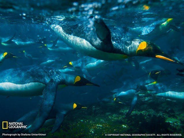
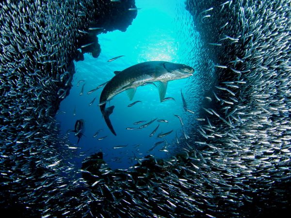
(Images are from national geography's photography contest)


Sharpness


Color


Size


Density


Things that don't belong


A familiar form


The danger of over doing
This is very common problem when creating contrast.
When you have too many of those red leaves that work as a contrasting element, the eye doesn't know anymore where to look.


Conceptions

Conceptions is all about telling a story.

You give the viewer a piece of your self, this is where experience shows. If you have been through a lot in your life, you will tell interesting stories more easily.
This is a subject where you really have to open your eyes and look around. What can you see?

  • Do you see a dirty car passing and somebody has written "I love you" in the window.
  • Do you see a busy street in rush hour, there a tired business man standing and looking in to emptiness with tie thrown over his shoulder.
  • Do you see a bus where all passengers are looking in one direction except one.

What can you see?


The story can be very simple


Or it can be very complicated
Creating conceptions is the part where you really have to look in the mirror and capture what touches you the most.

A story in an image requires one very important element - The viewer. You as an artist only give a set of conceptions, but the viewer is the one that actually completes the story.


Children
Children are usually a very good way of telling a story since they can tell so many things to different people.


Who is the story for?
Try to find a subject that your audience understands and can relate to and what makes them think.


Tuesday, December 7, 2010

Composition

Introduction and a word of warning
   These theories are good to know and some of them might help you out when you feel stuck with some image. Be aware though that they can also take away the originality from your work if you rely too heavily on theory. I've seen people change a strong composition to more generic and boring just because the theory says it's better this way.
   Then again if you are a concept artist in a big game company, your consistent art that looks the same as the next guy's might be exactly what they want.

   All in all I just wan't to warn you not to rely too heavily in theory and encourage you to trust your own vision for what looks good.


What can you do with composition?
  • Guide the eye to some area or point.
  • Create more aesthetic images with arrangement of elements


Phi - the golden number
Here is a site that finds phi in everything..
Phi is used to divide the image in to chunks that makes the image pleasing to watch.
This has been used since the building of pyramids.


Theory in practice
Ok, I admit, that theory is a bit thick and math heavy. I think it's better to look at those theories through examples to give you a better understanding what all that means.
The following examples are taken from this site:
http://production.4filmmaking.com/cinematography7.html

I've collected some examples from there, but you should check it out if you want to know more.


Shapes
You can use simple geometric shapes to help your picture composition. Can you see the triangle you get by connecting imaginary lines between the three nuns? This triangle adds strong visual unity to this picture.


Simplicity
Look for ways to give the center of interest in your pictures the most visual attention.
Simplify your pictures and strengthen your center of interest by selecting uncomplicated backgrounds, avoiding unrelated subjects, and moving in close.


Lines
It's a simple and easy path for the eye to follow to the main subject. You can also use repetitive lines to draw viewers' attention to your center of interest.


This sculpture has some beautiful lines, but they're obscured by the busy background. Let's simplify this picture by moving our camera viewpoint in close to the base of the sculpture.


Curves
One of the most common and graceful lines used in composition is called the S curve.


Balance
Good balance is simply the arrangement of shapes, colors, or areas of light and dark that complement one another so that the photograph looks well-balanced.


There are usually several ways to arrange or balance your subjects. You may choose the style on the left because you'd like to convey a feeling of formality-or you may prefer the more relaxed informal pose. They're both well balanced.


Framing
What we mean is to frame the center of interest with objects in the foreground. This can give a picture the feeling of depth it needs to make it more than just another snapshot.


Whether or not you use a frame for a picture will depend on each new subject. What you choose as a frame for the scene will, of course, vary as well.


Overlapping Elements
Near mergers may not be quite as objectionable, but they can steal attention from your center of interest. Near mergers are objects or lines that are just too close to the principal subject. In this case the ball and umbrella tip are near mergers.


Repeating Elements
Repeating elements in image is a good and easy way to tell the viewer what he/she is looking at. You can show only a small part of an element in the foreground but as you go towards the background you can incrementally reveal what that element looks like. 
Repeating elements is also a very good way to show scale of things.